The answer is yes! Colour blindness is actually a misnomer. Colour vision deficiency is the correct term. If you have colour blindness, you are still able to see hues. It gets more complicated when you try to differentiate tones and shades. So why did I not use the correct term in the title? Most people would not search for colour vision deficiency. There is a blog called colbindor.com that speaks to people with colour vision deficiency. If you go to this page, you can view the FAQ that the author has regarding it. This was definitely an eye opener for me. I had never thought about how this affected others.
The author has a tool that helps anyone with colour vision deficiency keep colors straight. It breaks down the colour by hue.
Color Name & Hue
Using the simulator (found here: Coblis Colour Blindness Simulator) I will show you the images that simulate each type of color vision deficiency.
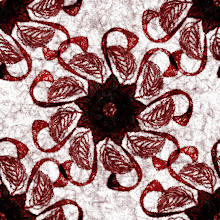
Here is an example of a design I created (normal color vision):
Red-Blind/Protanopia:
Green-Blind/Deuteranopia:
Blue-blind/Tritanopia:
Red-weak/Protanomaly:
Green-weak/Deuteranomaly:
Blue-weak/Tritanomaly:
Monochromacy/Achromatopsia:
Blue Cone Monochromacy:
This is a close simulation, but of course, it all depends on the severity of the condition. As you can see, each deficiency causes the design to change. However, the essence of the design remains the same throughout. Even in the case of Achromatopsia, the design is still intricate and contrasting enough that a person with color vision deficiency would be able to comment about, appreciate and enjoy it.
I don’t know if many designers even consider colour blindness when designing, but I found it fascinating. I hope you enjoyed learning about this misunderstood and often overlooked condition.
Keep creating!
Jannina


Very interesting!
ReplyDelete